
Introduction: Why the Picture on Artificial Intelligence Matters More Than Ever
You come across a picture on artificial intelligence almost every day. A glowing brain. A circuit board shaped like a human head. A robot hand reaching for a human one. These artificial intelligence images fill policy reports, news articles, and corporate strategy decks. They are supposed to make complex ideas feel simple and easy to grasp.
But here is the real problem with this picture of artificial intelligence. Most of these visuals are deeply misleading. They make AI look like pure magic. They hide the real world risks, the human labor behind the systems, and the difficult trade offs that policy professionals have to manage every day.
When you see a shiny, futuristic image accompanying a new regulation, it can shape your thinking without you even realizing it.
It can make a risky technology seem safe. It can make a complex governance problem seem simple. For anyone working in policy, relying on the wrong pic of artificial intelligence can lead to flawed analysis and poor strategic decisions.
In 2026, the stakes could not be higher. The 2026 C-Suite Outlook Survey from The Conference Board reveals that AI has moved rapidly from the margins of corporate strategy to the forefront. Leaders are under pressure to act fast. At the same time, the OECD highlights that many government AI initiatives face serious implementation challenges. Getting a clear, honest visual picture of what AI can and cannot do is now a strategic necessity.
This article gives you a practical framework. You will learn how to look at an AI visual and judge its real credibility. You will learn to spot hype versus reality. And you will learn how to use this skill to make sharper, more informed decisions in your own work.
Staying ahead of the fast moving AI narrative requires trusted daily analysis. To cut through the noise and get clear, practical insights, you can Get Free Updates from The Deep View Newsletter.
It delivers simple, actionable briefs straight to your inbox.
Why Visualizing AI Is a Critical Skill for Policy Professionals
If you work in policy, chances are you see some kind of picture on artificial intelligence every single day. Maybe it is a flowchart in a government report showing how an AI system makes decisions. Maybe it is a colorful infographic explaining a new compliance rule. Or maybe it is a simple diagram comparing different risk levels.
These artificial intelligence images are supposed to make things clear. And they can. A good visual can condense a messy trade off into something you can grasp in seconds. That is powerful. That is why regulatory documents now lean on diagrams to communicate compliance pathways, risk levels, and oversight steps.
But here is the catch. The same picture of artificial intelligence that simplifies can also oversimplify. If you look at a clean diagram that shows an AI system as a neat box with arrows in and out, it is easy to forget the messy reality behind it. The data biases. The human labor. The unpredictable failures.
The pic of artificial intelligence you rely on might be hiding real implementation challenges. The OECD recently found that many government AI initiatives struggle with exactly these kinds of hidden complexities. When you are making policy decisions, you cannot afford to be fooled by a pretty diagram.
In 2026, visual literacy in AI is no longer a "nice to have" skill. It is a core competency for effective policy analysis and advocacy. You need to read an AI visual the same way a lawyer reads a contract. You need to ask: What is this showing me? What is it hiding? Does this match the real world data?

AI governance is moving fast. The Grant Thornton 2026 AI Impact Survey notes that good governance now requires continuous oversight, not just a static policy. That same thinking applies to how you interpret AI visuals. One quick glance is not enough. You need to dig deeper.
Staying updated on how to read and use these visuals requires trusted daily insights. You can Subscribe Free to The Deep View Newsletter for simple, practical updates that help you separate the signal from the noise.
The Evolution of AI Imagery: From Technical Diagrams to Policy Narratives
That shift in visual literacy is not an accident. The way we draw a picture on artificial intelligence has changed a lot over the last few years. And understanding that evolution helps you spot when a visual is actually helping you versus just looking good.
In the early days of AI, most artificial intelligence images looked like something from a science textbook. You would see dense neural network diagrams with dozens of nodes and arrows. There were schematics showing layers of computation. These visuals were built by engineers for other engineers. If you did not have a technical background, they were nearly impossible to read.
This created a real problem. Policy professionals were expected to make decisions about AI systems, but the main picture of artificial intelligence they saw was designed for coders, not for them. As the Bipartisan Policy Center points out, making AI data truly accessible to decision makers requires a deliberate effort to improve readability. The old diagrams were failing at that job.
Now compare that to how we visualize AI in 2026. The best policy visuals today tell a story. They use clean infographics that walk you through a compliance pathway step by step. They use risk matrices that let you see trade offs in a single glance. They use flowcharts that show decision points, not just technical architecture.
This is a shift from technical schematics to policy narratives. The goal is no longer to show how the code works. The goal is to show how the system behaves, what risks it carries, and what rules apply. The pic of artificial intelligence you see in a policy brief now has a job to do. It has to persuade, clarify, and guide action all at once.
That matters because the audience for AI visuals has grown. It is not just engineers and data scientists anymore. It is regulators, legislators, business leaders, and the public. The Stanford AI Index highlights how crucial it is to measure AI across many dimensions, not just technical performance. Visuals are the tool that makes those dimensions visible to everyone.
So when you look at a modern AI visual, ask yourself what story it is telling. Is it a story about how the system works? Or is it a story about how the system should be governed? Knowing the difference changes how you use that visual in your work.
If you want to stay current on how these visual trends are shaping policy debates, you can Subscribe Free to The Deep View Newsletter. It gives you daily, simple updates that make complex AI topics easier to navigate.
Key Types of AI Visuals You’ll Encounter in Policy Work
Now that you know how the story behind a picture on artificial intelligence has changed, let’s look at the specific formats you will actually see in policy documents. Each type has a job to do. If you learn to read them, you will understand the policy message much faster.
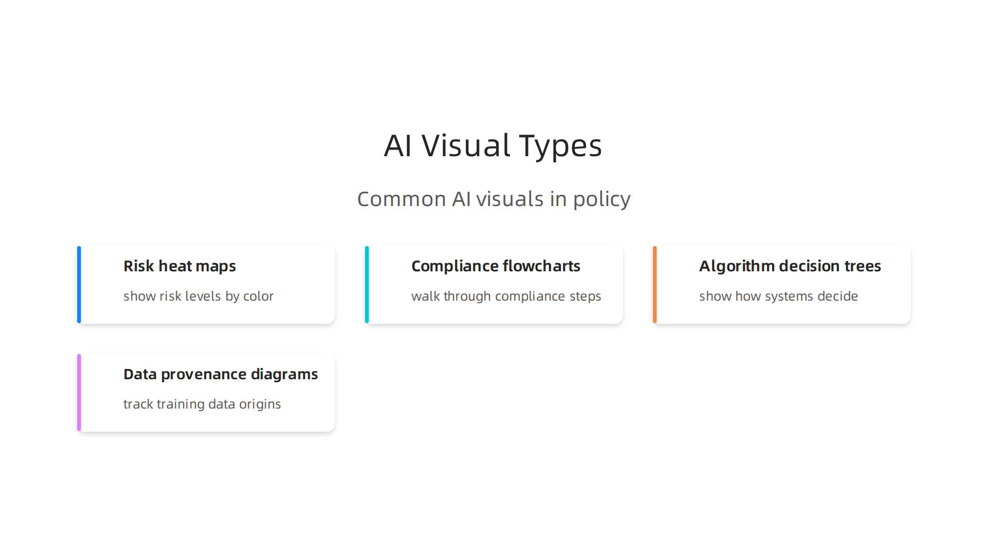
Here are the four most common artificial intelligence images used in policy work today:
-
Risk heat maps: These use colors to show where AI systems pose high or low risk. They make it easy to compare trade offs in a single glance. A dark red area tells you "pay attention here." A green area says "this is safe enough." They are built for quick risk communication.
-
Compliance flowcharts: These walk you through a step by step process. Do you need to file a report? Does the system require a human review? The flowchart shows you the path. It turns a dense regulation into a simple yes or no journey.
-
Algorithm decision trees: These show how an AI system makes choices. Each branch represents a decision point. They help policy professionals see where bias could sneak in or where transparency is needed. They are not for engineers. They are for oversight.
-
Data provenance diagrams: These track where training data comes from. They show the journey from collection to model output. In 2026, as governments like those highlighted by Granicus formalize AI governance, knowing data origins is critical for accountability.
Each picture of artificial intelligence serves one purpose: to make a complex idea visible. A risk map is about warning. A flowchart is about action. A decision tree is about logic. A provenance diagram is about trust.
When you see a pic of artificial intelligence in a policy brief, stop and ask what job it is doing. That simple habit will save you time and help you spot weak arguments.
If you want to get better at reading these visuals and understanding the policy debates behind them, Subscribe Free to The Deep View Newsletter. It delivers clear daily updates on AI governance and technology policy.
Infographics and Data Visualizations
You are in a policy meeting. Someone shares a picture on artificial intelligence that shows a colorful bar chart with a bold headline claiming "AI adoption jumps 300 percent." It looks impressive. But is it true? That is where you need to pause.
Infographics and data visualizations are everywhere in policy work. They combine statistics, timelines, and icons into a single artificial intelligence images that tells a story fast. Take the AI Governance infographic from OneTrust. It walks you through the entire process of starting a governance program in one clean visual.
That is useful.
But here is the catch. A picture of artificial intelligence that shows model performance or bias metrics requires careful reading. You need to check the axes. Look at the scale. Ask about confidence intervals. A small axis adjustment can make a risk look much smaller or much bigger than it really is. As BARC notes in their 2026 priorities for data leaders, understanding these metrics is now a core skill for anyone working with AI.
Some infographics are misleading on purpose. They overstate what AI can do or understate the risks. If a pic of artificial intelligence shows a straight line going up forever, ask yourself what data is missing. In 2026, with so many new AI data visualization tools available, bad visuals can spread fast.
Before you trust a policy infographic, audit it. Check the source. Check the scale. And if you want to stay sharp on reading these visuals, Subscribe Free to The Deep View Newsletter for daily AI policy clarity.
How to Identify Misleading AI Images and Deepfakes
Imagine you are preparing for an important policy meeting. Someone shares a picture on artificial intelligence that shows a government official saying something shocking. The image looks real. The lighting seems right. The background matches. But here is the thing: that picture of artificial intelligence might be a complete fake.
Deepfakes are now a real problem in policy debates. Bad actors use artificial intelligence images to spread false information and confuse the public. In 2026, advanced tools make it harder than ever to tell what is real and what is not. According to a 2026 guide on detecting AI images, checking for inconsistencies in lighting, shadows, and perspective is a good first step.

Look at the eyes. Do they blink naturally? Is the reflection in the eyes consistent with the scene? Small details often give deepfakes away.
Metadata also matters. Many AI-generated images leave digital clues in their file data. Tools can check for these markers. The UK government has published guidance on using detection technology to spot fakes in identity verification and content moderation.
Legislators are catching up. As of May 2026, 30 states have enacted laws specifically targeting deepfakes in political communications. That number grew quickly this year. But laws alone cannot stop every fake from spreading.
The best defense is a careful eye. Never trust a pic of artificial intelligence that you see shared fast online. Pause. Zoom in. Check the source. Use online detection tools if you can.

And stay informed about the latest threats.
If you want to keep up with AI policy news and learn how to spot misleading content, get simple daily updates. Subscribe Free to The Deep View Newsletter for clear AI insights every day.
Technical Indicators of AI-Generated or Altered Visuals
Now that you know the basics of spotting fakes, let us get into the technical details. AI generated images often leave small but telling flaws behind. These clues are your best friends when you look at a picture on artificial intelligence that seems off.
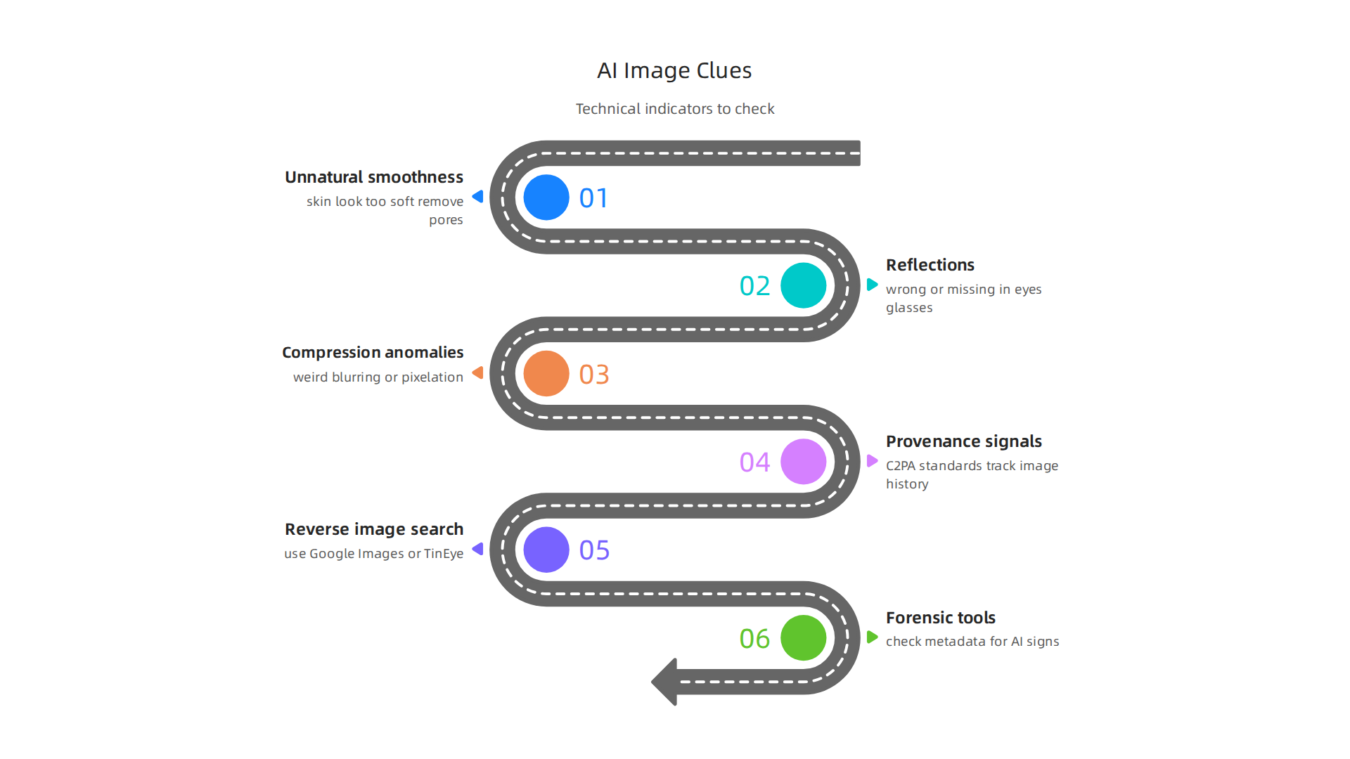
First, check for unnatural smoothness. AI generators sometimes make skin look too soft. They remove pores, fine lines, and texture that real cameras capture. Also look at reflections. In a real photo, reflections in eyes, glasses, or windows match the scene. In an artificial intelligence image, those reflections may be wrong or missing. According to a detailed 2026 guide on detecting AI-generated images, compression anomalies are another clue. AI images often have weird blurring or pixelation in certain spots that does not match the rest of the scene.
There is good news. New standards like C2PA help track where an image came from. This is called provenance. It works like a digital label that shows the image history. Experts recommend that regulators require platforms to preserve these provenance signals to slow the spread of harmful fakes.
You can also do a simple reverse image search using a tool like Google Images or TinEye. Just upload the pic of artificial intelligence and see where else it appears online. If it shows up first on a site known for AI content, that is a red flag. The UK government has endorsed detection technology for identity verification and content moderation.
Do not forget about forensic tools. Some can check metadata for signs of AI generation. Tools like UNCOVAI now work to identify deepfakes and dark web threats in real time. The market for these tools is growing fast, with the AI deepfake detector market projected to hit over $1.5 billion by 2032.
The takeaway is simple. Look for the technical flaws. Use the available tools. And never fully trust a picture of artificial intelligence until you have checked it yourself.
If you want to stay ahead of these threats and get clear daily updates on AI policy, Subscribe Free to The Deep View Newsletter.
Best Practices for Creating Policy-Relevant AI Visuals
Creating a picture on artificial intelligence for policy work is different from making a fun social media post. If your goal is to inform lawmakers, regulators, or the public, your artificial intelligence images need to be clear, honest, and accessible. A misleading visual can do real harm, even if it was made with good intentions.
Start by being fully transparent about your data. Every picture of artificial intelligence you create for policy should clearly state where the data came from, what assumptions you made, and how much uncertainty exists. If your model has a confidence range, show it. Your audience needs to know what the visual really means and what it does not cover. This builds trust and prevents misinterpretation.
It also helps to test your visuals with the people who will use them. Before you release a pic of artificial intelligence for a briefing or report, show it to a few legislators or policy staffers. Ask them what they see and what questions they have.

You might discover that a chart you thought was simple is actually confusing. Iterative testing catches those problems early.
Accessibility is not optional. For any public-facing document, use colorblind-friendly palettes. Patterns and textures can help distinguish data points without relying on color alone. Always add alt text that describes the visual clearly for screen readers. AI infographic generator templates can help you create professional designs quickly, but you still need to set up the accessibility features yourself.
Think about the tools you use too. The best AI data visualization tools in 2026 offer built-in options for adding metadata, notes, and accessibility tags. Use those features to make your work more useful and more trustworthy.
When policy decisions rest on what a visual shows, every detail matters. Make your visuals easy to understand, honest about their limits, and usable by everyone.
Want to stay updated on the latest in AI policy and governance? Subscribe Free to The Deep View Newsletter for clear daily insights.
Case Studies: Visualizing AI Governance Frameworks Across Jurisdictions
The best way to see how a picture on artificial intelligence shapes real policy is to look at how different countries are using them today. In 2026, the United States, the European Union, and the United Kingdom each take a distinct approach to visualizing their AI rules. These artificial intelligence images help companies, lawmakers, and the public understand complex regulations quickly.
The United States relies on the NIST AI Risk Management Framework. This framework uses heat maps and tiered diagrams to communicate risk scenarios. A red square on a heat map tells a company immediately that it needs to take action. These visuals turn abstract risk scores into a clear picture of artificial intelligence risk that everyone on a team can understand.
The European Union uses a different visual language for the EU AI Act. Their official guidance materials feature color coded risk categories. Unacceptable risk is red. High risk is orange. Limited risk is yellow. Minimal risk is green. The EU AI Act framework also includes detailed compliance flowcharts. These help companies figure out their exact legal obligations step by step. This kind of pic of artificial intelligence regulation makes a complex law much easier to navigate.
The United Kingdom takes a more flexible approach with its AI White Paper. The UK government visualized its regulatory pathways using decision trees and stakeholder maps. These tools help companies ask the right questions about their specific AI use case. Who does your system affect? What sector are you in? The decision tree shows the way forward.
As this 2026 guide to global AI regulations explains, each framework serves a different purpose, but they all depend on strong visuals to work. A good picture on artificial intelligence can save a legal team hours of confusion and help the public trust the process.
Keeping up with different rules across countries is a real challenge in 2026. You need a source that cuts through the noise and gives you simple, clear updates every day.
Want to stay on top of all these global shifts? Subscribe Free to The Deep View Newsletter for daily AI policy insights that actually make sense.
United States, European Union, and United Kingdom Approaches
Now that you have seen how these frameworks look in action, let’s break down what makes each one unique. The picture on artificial intelligence that each country uses tells you a lot about its priorities.
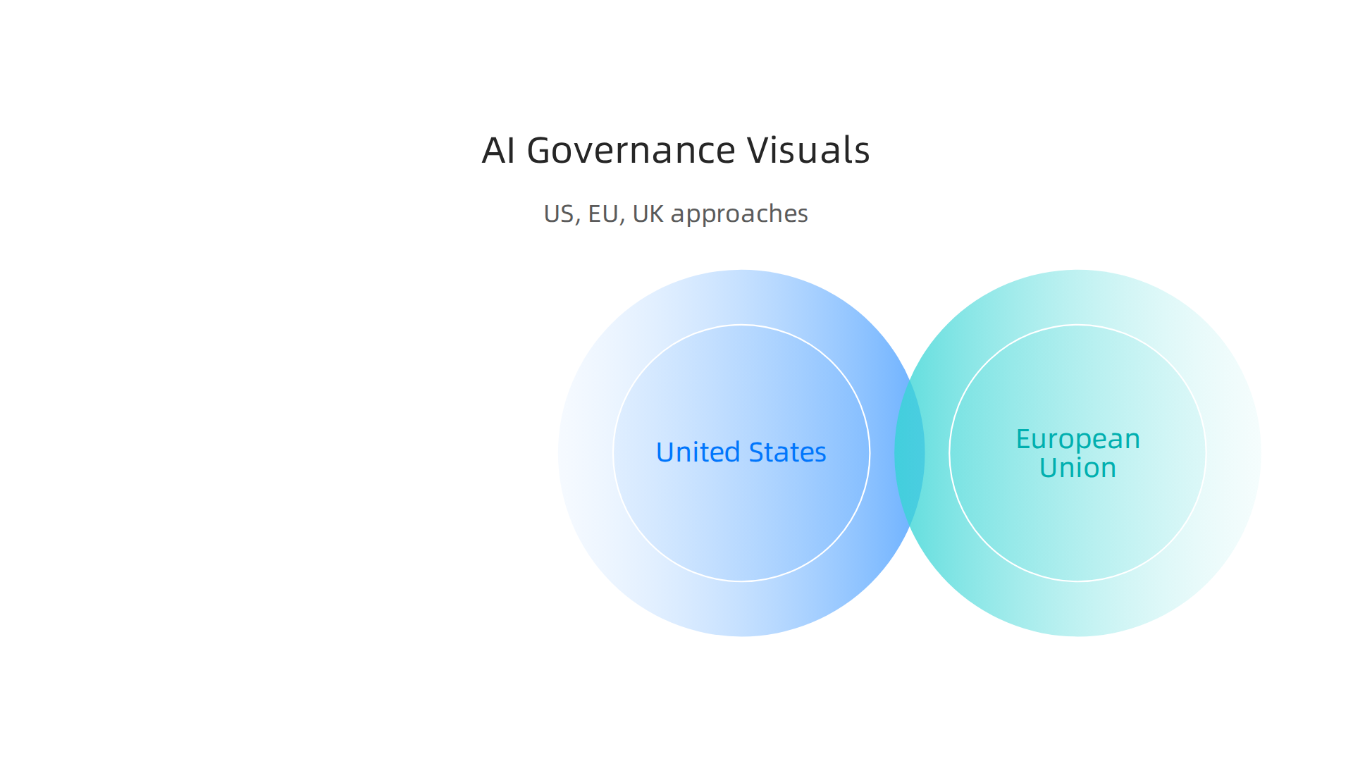
The United States leads with modular, sector specific visuals. The NIST framework focuses on risk management using heat maps and tiered diagrams that adapt to different industries. A hospital’s artificial intelligence images will look different from a bank’s. This flexibility helps companies apply the framework to their own situation without a one size fits all rule.
The European Union takes the opposite approach. The EU AI Act requires universal compliance visuals with strict color coding. Red for unacceptable risk. Orange for high risk. Yellow for limited risk. Green for minimal risk. Every company in every sector uses the same code. This makes it easy for regulators to spot problems fast. You can see the official EU AI Act framework here to understand how the color system works.
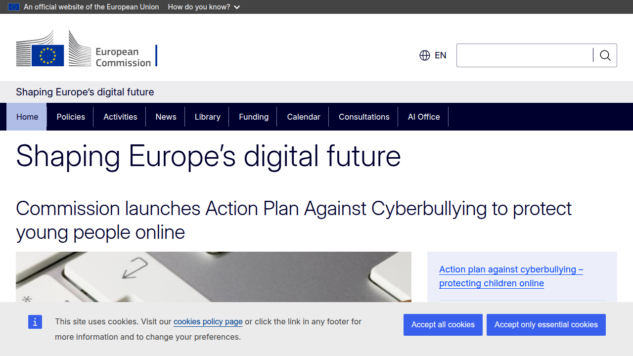
The United Kingdom sits somewhere in the middle. The UK government created pathway visuals that look like decision trees. These tools guide companies through regulatory steps one question at a time. Ask yourself: What sector are you in? Who does your AI affect? The decision tree walks you forward.
As this 2026 guide to global AI regulations explains, the picture of artificial intelligence rules in each country reflect different regulatory philosophies.
Keeping up with all these different approaches is tough in 2026. You need a source that cuts through the complexity and gives you clear, daily updates.
Subscribe Free to The Deep View Newsletter for simple AI policy insights delivered to your inbox every day.
Tools and Resources for AI Visualization
So you understand the different regulatory frameworks, but how do you actually build your own picture on artificial intelligence for compliance?
You need the right tools. And luckily in 2026, there are plenty of options. Some are simple. Some are very advanced. Here is a quick breakdown to help you choose.
General purpose visualization tools
These work for almost any kind of chart or diagram. Tools like Tableau and Flourish let you create heat maps, decision trees, and risk matrices without any coding. You can drag and drop your data, pick a template, and export a clean visual. As this 2026 guide to AI data visualization explains, these tools are great for storytelling and presentation.
Specialized tools for AI policy visuals
If you need something built specifically for AI governance, look at tools like IBM’s AI Explainability 360 or Google’s What-If Tool. These let you test your model, spot bias, and create artificial intelligence images that show exactly how your system behaves. They are more technical, but they give you the depth that auditors expect. The 2026 AI Governance Tools comparison recommends looking for platforms with bias detection and automated regulatory alignment features.
Pre made templates from think tanks
You do not have to start from scratch. Groups like the Stanford Institute for Human Centered AI publish the 2026 AI Index Report with ready to use visualizations. The White House also released a National Policy Framework with sample diagrams you can adapt. These resources save you hours of design work.
Emerging AI powered assistants
Here is where things get exciting. New tools can now generate a full picture of artificial intelligence chart just from a sentence. You type "show me the risk levels for my healthcare AI tool" and the assistant builds the visual for you. As this article on AI data visualization trends notes, these tools are transforming how analysts work by automating chart creation from natural language.
You do not have to be a designer. You just need the right tool for the job.
Want more resources like this delivered daily? Get Free Updates from The Deep View Newsletter for simple AI insights straight to your inbox.
Summary
This article explains why the picture on artificial intelligence matters for anyone working in policy, business, or governance. It shows how visuals have shifted from technical schematics to policy-focused narratives and why that change affects decision making. You will learn the most common types of AI visuals—risk maps, compliance flowcharts, decision trees, and data provenance diagrams—and how each one is designed to communicate specific trade‑offs. The guide outlines how to read infographics critically, how to detect deepfakes and AI‑generated images using visual cues and metadata, and what technical indicators to watch for. It also gives practical advice on creating transparent, accessible visuals for lawmakers and the public, plus examples from US, EU, and UK frameworks. After reading, you will be able to audit AI images faster, avoid common pitfalls, and choose the right tools to produce trustworthy policy visuals.